Microsoft is conducting an online course on Analyzing and Visualizing Data with Excel. The course enable students to 'Explore data analysis and visualization in Excel', the cloud benefits of Power BI, and Power Pivot, pivot tables, and tools previously known as Power Query.
About the Course:
During the course, student will get an introduction to the latest ve100rsions of these new tools in Excel 2016. See how to import data from different sources, create mashups between data sources, and prepare the data for analysis. After preparing the data, learn about how business calculations-from simple to more advanced-can be expressed using the DAX calculation engine.
And see how these different technologies work together inside Excel. Learn how the data can be visualized and shared to the Power BI cloud service, after which it can be used in dashboards, queried using plain English sentences, and consumed on mobile devices.

Course Syllabus:
Week 1
- Setup the lab environment by installing Office applications.
- Learn how to perform data analysis in Excel using classic tools, such as pivot tables, pivot charts, and slicers, on data that is already in a worksheet / grid data.
- Explore an Excel data model, its content, and its structure, using the Power Pivot add-in. Create your first DAX expressions for calculated columns and measures
Week 2
- Learn about queries (Power Query add-in in Excel 2013 and Excel 2010), and build an Excel data model from a single flat table.
- Learn how to import multiple tables from a SQL database, and create an Excel data model from the imported data.
- Create a mash-up between data from text-files and data from a SQL database.
Week 3
- Get the details on how to create measures to calculate for each cell, filter context for calculation, and explore several advanced DAX functions.
- Find out how to use advanced text query to import data from a formatted Excel report. Perform queries beyond the standard user interface.
Week 4
- Explore ways to create stunning visualizations in Excel. Use the cube functions to perform year-over-year comparisons
- Create timelines, hierarchies, and slicers to enhance your visualizations. Learn how Excel can work together with Power BI
- Upload an Excel workbook to the Power BI service. Explore the use of Excel on the mobile platform
Prerequisites
Candidates should fulfill the following prerequisites:
Understanding of Excel analytic tools such as tables, pivot tables and pivot charts.
Also, some experience in working with data from databases and also from text files will be helpful.
1. Windows operating system: Windows 7 or later.
2. Microsoft Excel on Windows operating system (Mac versions not supported):
Microsoft Excel 2016 Professional Plus or standalone edition (Preferred)
Microsoft Excel 2013 Professional Plus or standalone edition (with some limitations in capability)
Microsoft Excel 2010 (with major limitations in capability)
Other versions of Microsoft Excel are not supported
Course Details:
- Course Length: 4 weeks
- Course Starts on: April 1, 2016


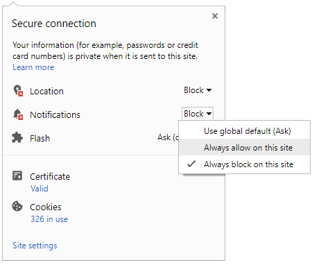
 Click it and Unblock the Notifications


